I may be from Texas, but I still don’t love burnt orange

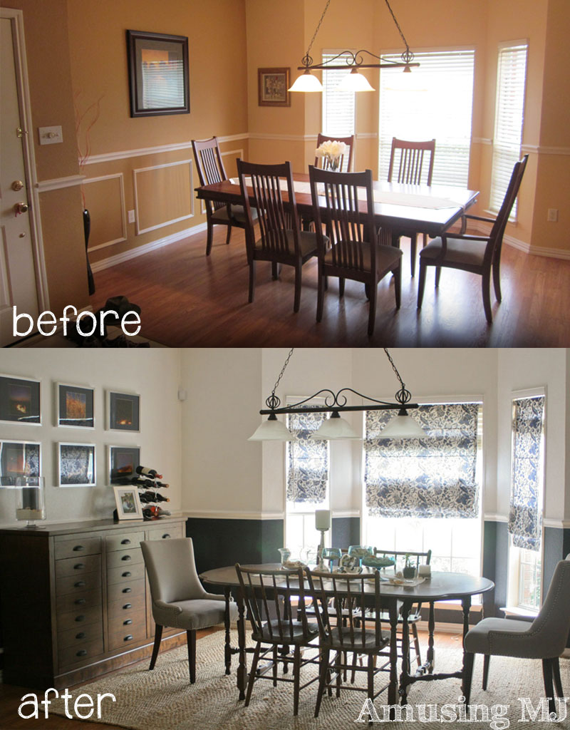
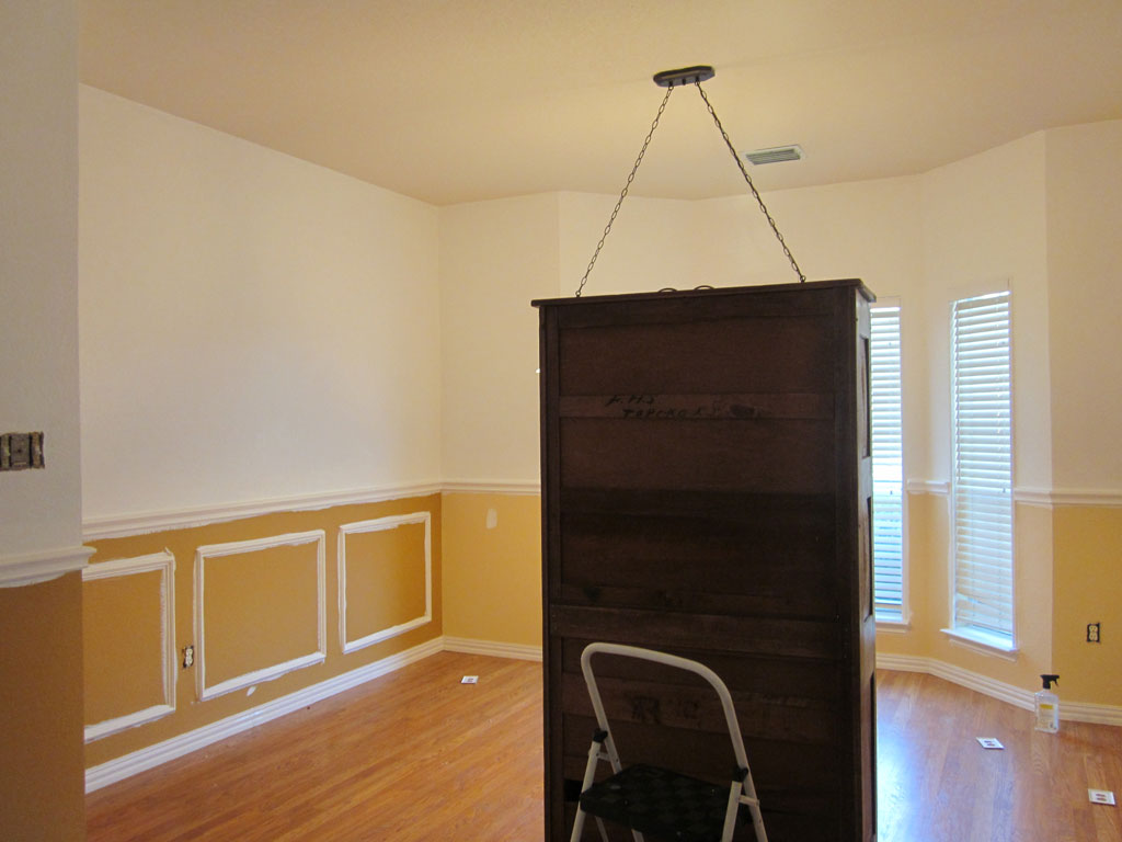
So if you read the House Tour Before post you’ll remember that when I moved into my house this is what my dining room looked like:
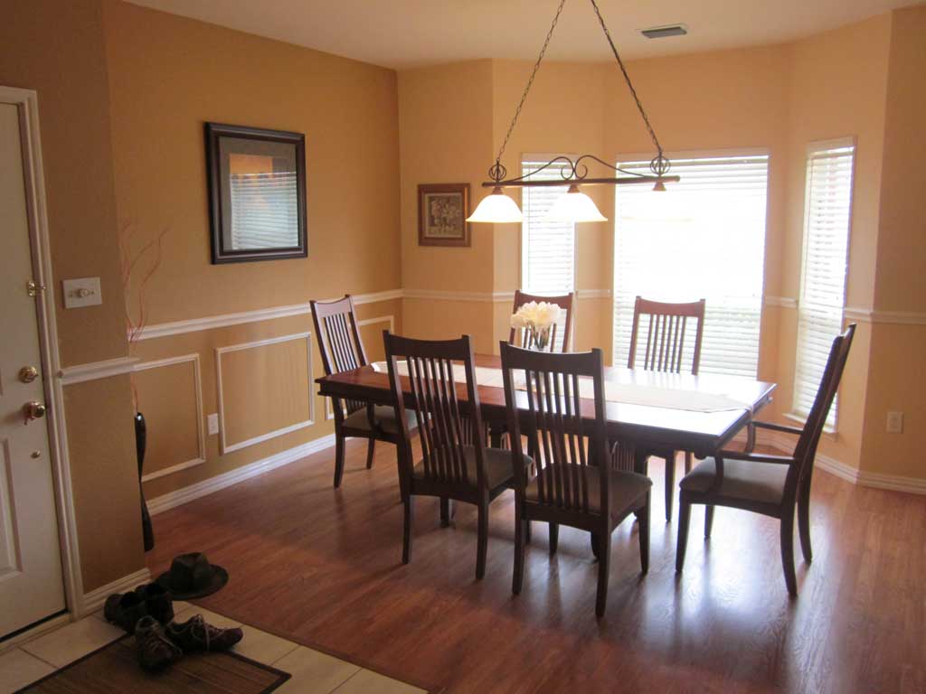
dining-room-before1 That’s my front door on the left… I have this weird side entry thing going on so the windows above are facing the front of the house, but the front door is to the side.  Moving on… this wasn’t exactly the color scheme I had in mind for my new house, and since it was absolutely the first thing you saw, I wanted it changed PRONTO.  (although we hadn’t even met at the time I painted this room… I married an Aggie, so even if it had stayed it would be long gone by now!). Just one more before pic so you can fully appreciate the intensity of the orange… and with a peach accent wall to boot!  dining-paint7
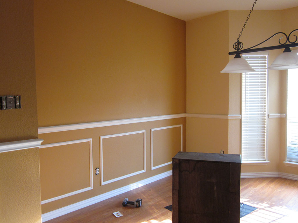
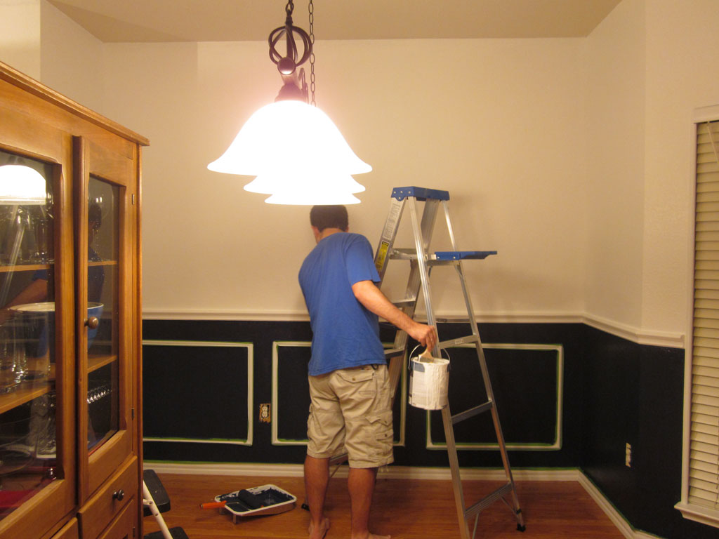
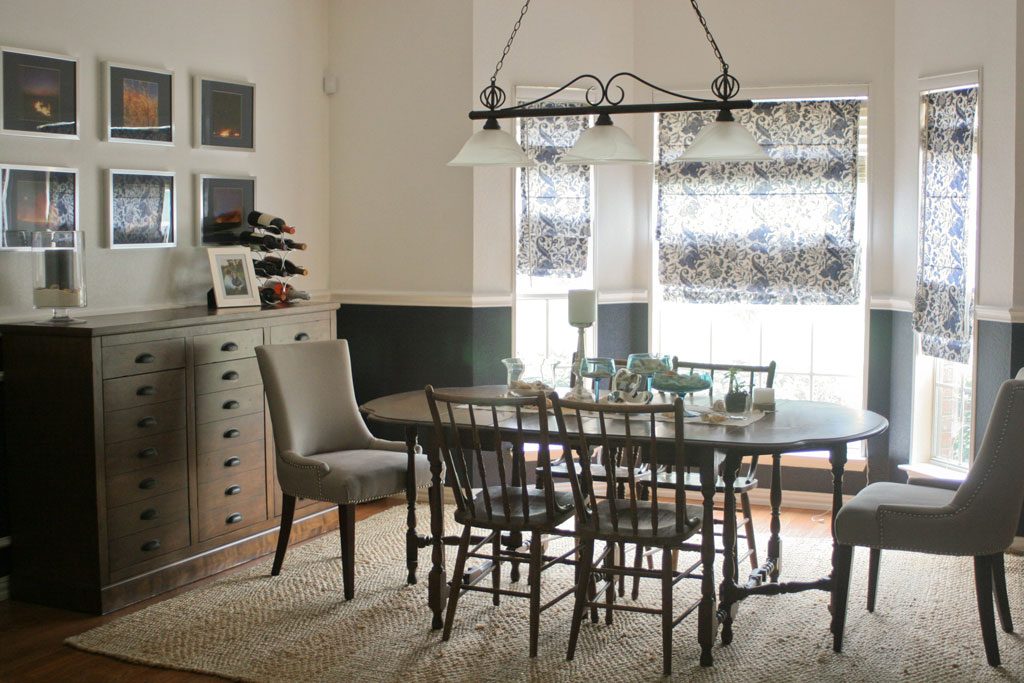
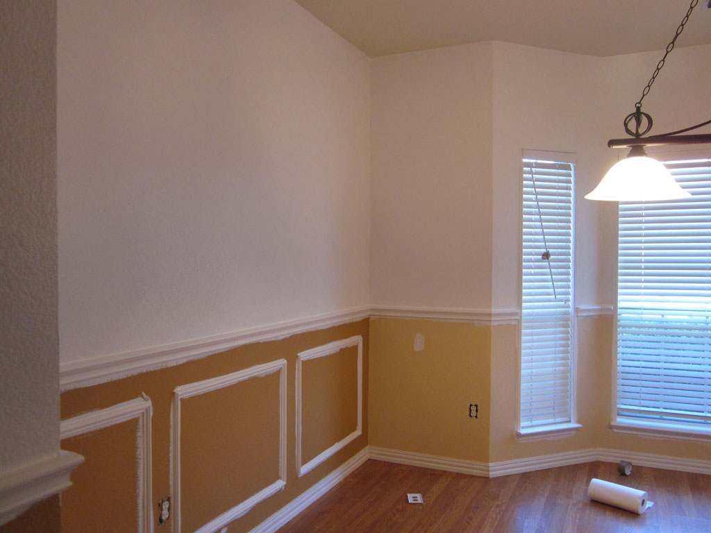
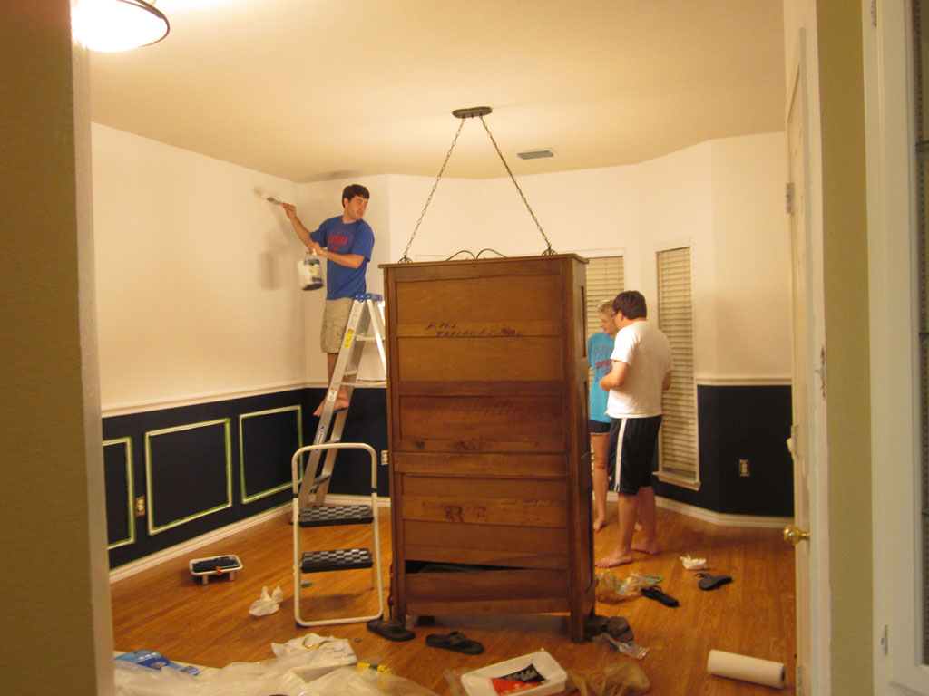
So I did what any single girl on a budget in her first house did… I bribed a couple of friends with pizza and beer to come over and help me paint the orange away.  When I explained to my friend what colors I had picked… he looked at me like I was crazy.  Even crazier when we opened the paint can… and it was SO DARK.  But I loved it, and hoped the white chair rail frames would look super crisp and tone down the dark background.  dining-paint6 Partway through the process… you can see we painted the chair rail with the same white as the top because they were a bit yellow-y compared to the ULTRA BRIGHT WHITE paint I picked.  I now know that there are a bajillion (scientific number) shades of white out there… and ultra bright white might not be the best choice, but it looks perfectly fine…. and lesson learned.  dining-paint5 The room already looked a lot bigger with the top half painted white, now to add in the moody Navy color:   dining-paint4 dining-paint3 Fast forward a bit and here is how the room looks now (a bit more styled!): 


dining-room-after


AHHHH much better! And just for comparison… one more before and after:

Dining-Before-and-After

Where I spend most of my days…

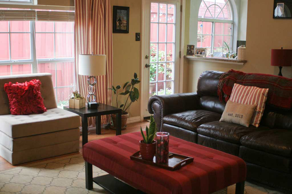
Chillin out, maxin, relaxin… but not really shooting bball.  Anyway… enough old school Will Smith.  It’s just the song that came to mind this morning. The living room is truly where the husband, dog dog, and I spend most of our time.  I’m a pretty big TV junkie (at one point during my single days I had a season pass on my DVR for 18 hour long tv shows… even without commercials that’s a huge chunk of your week!).  Watching a few hours of tv a show is how my husband and I typically wind down our day, and mostly that happens in the living room.  Aside from the kitchen I think it is the most used room in the house. living-room-from-doorway

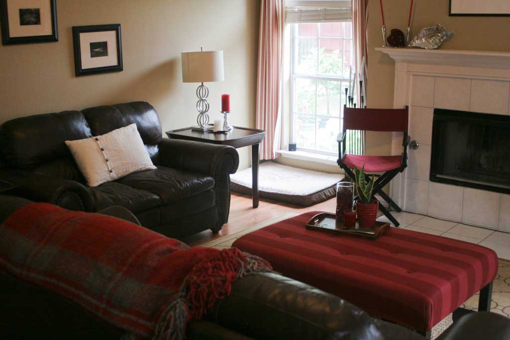
Part of the whole getting married thing was merging the husband’s stuff from his apartment into the house where I was already living. Fortunately our things seemed to mesh pretty well, and his biggest pieces of furniture were these super comfy (and seriously manly) brown leather couches.  I have never been a huge brown fan, but I love these couches.  They are so comfortable and perfectly sized for my husband and I’s less than giant frames (both of us come in under 5’5″).  It wouldn’t seem like that big of a deal, but there is nothing more irritating than feeling like a 4 year old who’s legs don’t reach the ground when you sit on a couch built for NBA players.  PS both my brothers and my dad are 6’+, so I’ve sat on a few giant sized couches in my life. Anyway… I’ve gotten sidetracked. The living room. living-room-from-corner1

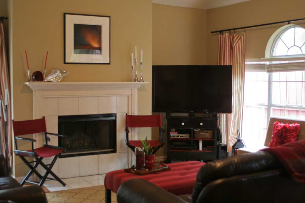
Situated at the back of the house, our living room has a window to the backyard and a door to the side patio (the backyard wraps from the side of the house with a patio, to the back yard where our lawn is).  I kept most of my red/crimson colored things in the living room because I think they coordinate pretty well with the brown leather.  I know its not the ‘light and bright’ living rooms that are super popular right now, but it feels cozy and home-y to me, and we love relaxing here at the end of the day.

living-room-from-outside-do

I’m going to post about the DIY Ottoman on Wednesday, but I love its pop of color in the middle of the room.  My grandmother and aunt sewed the curtains for me when I was in my last house, and I haven’t spent the time to make the the right length for this room, apparently they are taller ceilings… that’ll be done at some later date. (see how short the one on the right is? fortunately tables/the media cabinet hide it most of the time!)

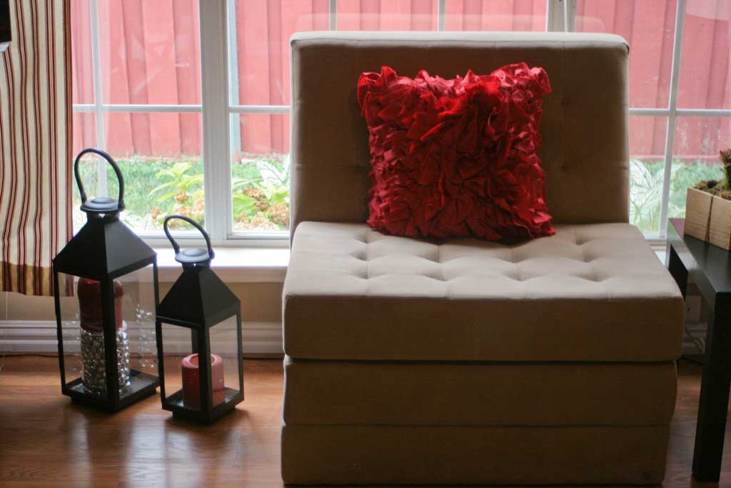
living-room-tufted-chair

The two director’s chairs and the circular ring lamps are from Pier 1.  I don’t think they sell those lamps anymore, but they have the best director’s chairs and always have fun fabric colors and designs if I ever want to move them to another location. (see picture #1). The tufted chair above was a Homegoods find that I had to stand and ward off other purchasers while my BFF and I figured out how to get it to the checkout counter.  For movienights, it folds out into a bed.  

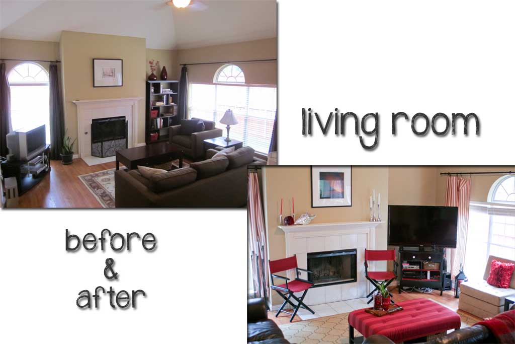
And just to see where this room came from (the before is the previous people’s furniture):  living-room-before-and-afte

Kitchen

I don’t know about your house, but the kitchen always seems to be the center of everything at mine.  It is where all the people gather at parties, madly packing into the small area despite the spacious family room with comfy couches right next door! But alas, people gather in the kitchen, surrounding the food and seem to appreciate the casual nature of standing around leaning against the kitchen counters.

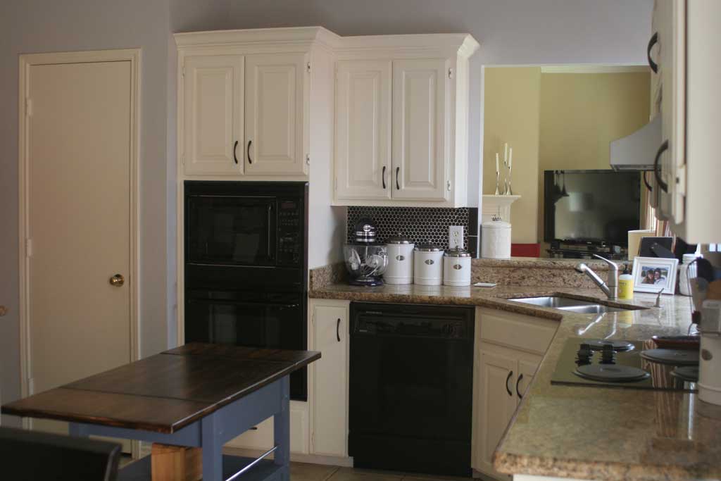
The kitchen in my house is one of the things I fell in love with first.  I loved the white-(ish) cabinets, the bright light it gets from the sliding glass door, and the fact that it is both literally and figuratively the heart of the home.  kitchen-from-sliding-glass-

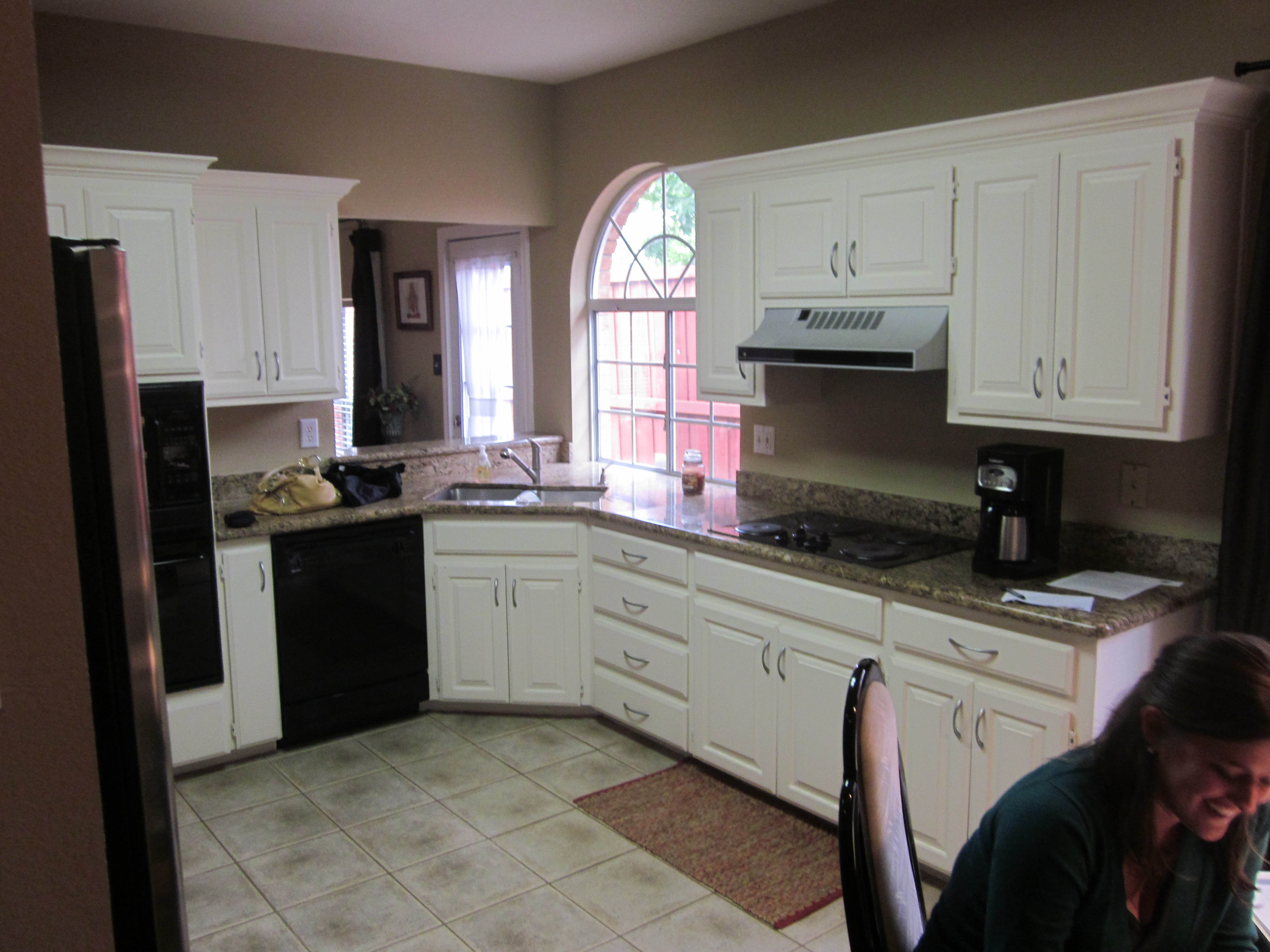
When I bought the house, this is what the kitchen looked like:

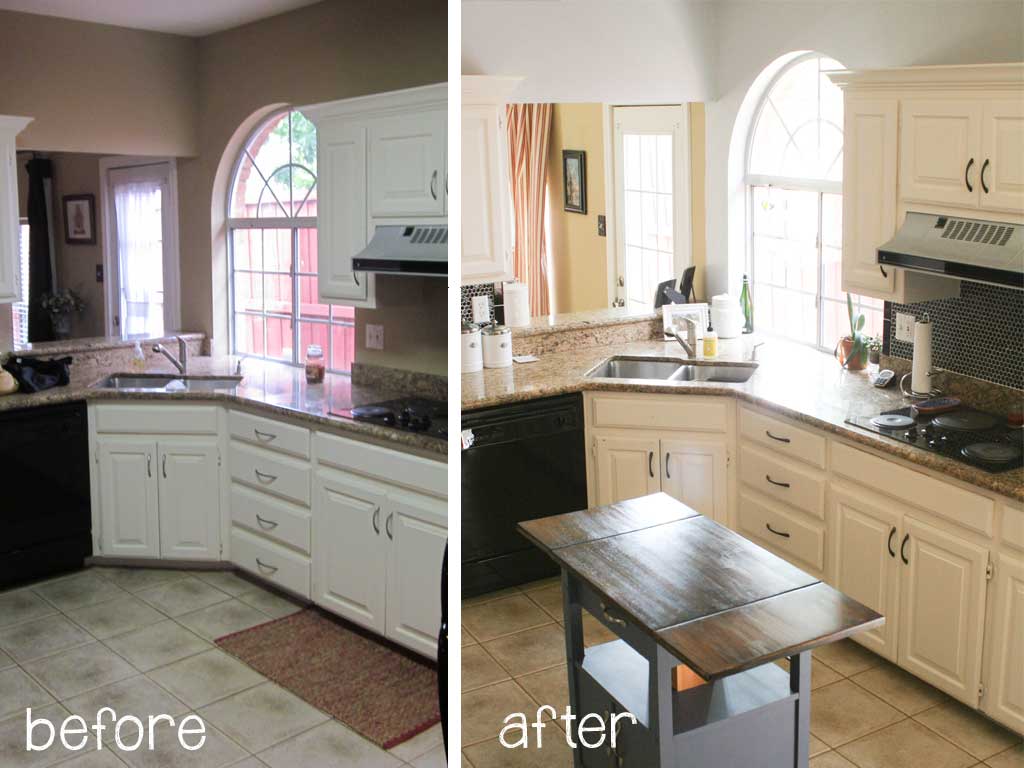
kitchen before In fact that’s me in the corner signing off on the inspection information prior to purchase.  Over the course of the two years I have owned this house I tiled the backsplash, painted the handles to the cabinets, added an island cart, and changed out the curtains. I consider this room MOSTLY done… (is a room ever REALLY done??).  The things I’d like to add to this room are:

  • change the old microwave/oven out for double ovens
  • build out the molding on the opening to the family room
  • add a rug?
  • figure out if I can change the large fluorescent light fixture for something more elegant.
  • change out the alien light fixture?
  • change out the sink faucet for one that still swivels and hasn’t been calcified

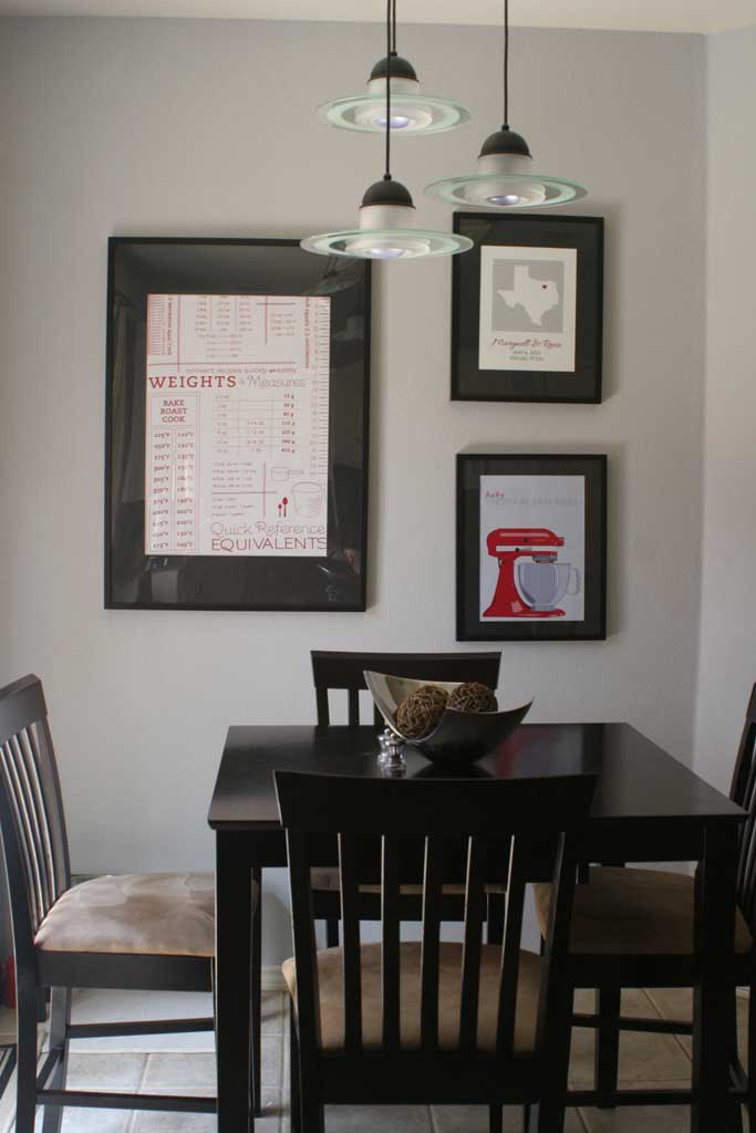
What alien light fixture you might ask?  This one:

kitchen-table-and-gallery-w Is it just me or does that look like a few alien ships are about to land on my kitchen table? But for now it fits in the color scheme and provides good light over the table, so I’ll leave it until I find something perfect or aliens really do come landing on my table. This is the view from the kitchen island looking back at the breakfast table.  That table and chairs were one of my first purchases when I got my first apartment. I think the grand total was around 500 dollars for all of it from Target. The table even has a built in leaf that is easy to change sizes.  Its seen its fair share of wear and tear (look at me rhyming!), but it fits perfectly in this space and I’ll probably use it for several more years.  My one big beef with it is that it is counter height, which I love the aesthetic of, but it makes adding additional chairs impossible, so 4 is my limit at this table.  If there are any more than that we have to move into the formal dining room or sit on couches. The three pictures behind it are recent additions: the towel is this one from Crate and Barrel in red. I just spray adhesived it to poster board and hung it in these awesome giant frames from Ikea. (I had to get a friend cut the mat board to have a big enough opening to fit the towel.) The picture on the top right was a shower gift with our names and wedding date on it, and our lovely state of Texas. And the bottom one is an Etsy purchase found here. It has a Kitchen Aid (my favorite thing!!) and says: baby, you spin me right round.  I love it! Although the pops of red don’t show up anywhere else in the kitchen, they can be found throughout my house and brings a little unity with the rest of the house! (and I love how sharp they look with the black frames and mats!)

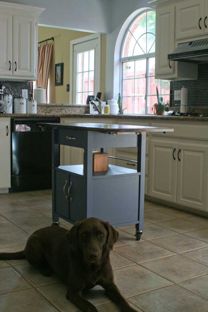
kitchen-with-lexie The kitchen island/rolling cart I added because I needed a little extra counter space, the kitchen is large, but doesn’t have a lot of just free counter space for food prep, so I brought this guy down from the attic.  I believe my brother bought it YEARS ago from Target.  I’ll show you its various stages in a later post, but I refinished it to coordinate better with this kitchen.

PS… don’t mind Lexie, she is fairly confident she is the center of attention at all times, and was just posing for the camera.

And the completed before and after:

Kitchen-Before-and-After For some reason the coloring is a little off in the before picture.  The cabinets have always been a little creamy white not true white, and the floor is more true to life in the after picture.